








Simplifying complexity to accelerate growth
Quest Technology Management had built a strong reputation delivering comprehensive IT solutions.
Their services were robust, but the way they were grouped and marketed made it difficult for prospects to quickly understand the full scope of what Quest offered. Sales conversations required too much explanation. Marketing materials lacked cohesion.
The challenge wasn’t capability. It was clarity. Before redesigning anything, we restructured the foundation.
Client
Quest Technology Management
Role
Creative Director & Lead Designer
Services
Services audit
Brand identity
Sales collateral
Digital & print campaigns





Clarifying the offering
We began with a service audit to evaluate how Quest defined and marketed its capabilities. While their expertise was strong, the structure behind it lacked cohesion, with overlapping offerings and inconsistent messaging that required explanation instead of communicating clearly on its own.
We reorganized their services into five defined pillars, creating a streamlined framework that sharpened sales conversations, aligned marketing efforts, and helped clients quickly understand where they fit. With clear categories and messaging guardrails in place, the team could efficiently create new sales materials and introduce emerging services without reinventing the structure each time, turning complexity into a scalable, repeatable system.

Modernizing the brand
The IT landscape is crowded and visually predictable. Conservative palettes. Rigid grids. Box-heavy layouts. We saw an opportunity to stand apart while maintaining professionalism.
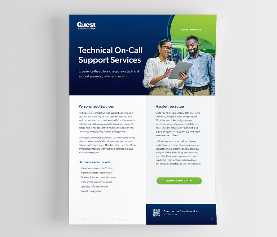
We introduced a more vibrant color system and icons anchored to the five service pillars. The palette felt energetic but professional, allowing Quest to remain credible while becoming more recognizable.
Circular design elements and layered photo treatments became defining features of the system. In a box-dominated industry, these forms introduced movement and integration, subtly reinforcing connectivity across services.
The result was a brand that felt confident, modern, and differentiated.
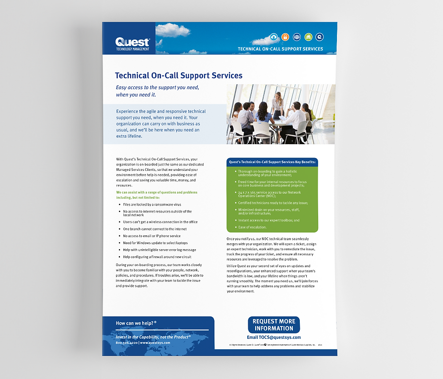
Sales sheets before the rebrand
Sales sheets after the rebrand

Designing for performance
The work extended beyond visuals. We helped shift Quest toward more intentional digital marketing, developing materials and campaign structures designed to be measurable.
We introduced a more vibrant color system and icons anchored to the five service pillars. The palette felt energetic but professional, allowing Quest to remain credible while becoming more recognizable.
The goal was not just better design. It was better insight.
28%
increased sales
(year-over-year)
42%
increased downloads
(ebooks and sales sheets)
68%
increase in sales materials
(year-over-year)
Results
Refreshing our sales materials and building out an organized system has empowered our team to develop new tools that are more effective, engaging, and align with our vision for our brand.
Barbara Klide
Communications Manager, Quest Technology Management


