top of page
Outlook Forum
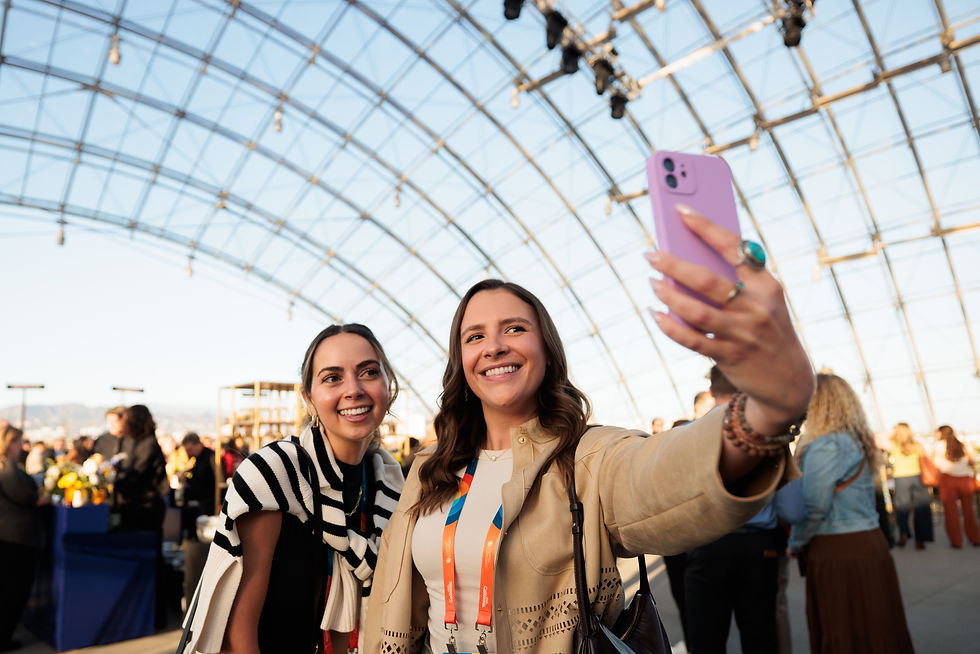
Every year, Visit California’s Outlook Forum brings together leaders who shape how the world experiences California. It’s a room full of people who already believe in the state’s potential, but belief alone isn’t enough. The forum has to ignite momentum, create alignment, and leave people feeling like they’re part of something bigger than a conference agenda.
In 2025, the event landed in Los Angeles, a city layered with culture, creativity, and contradiction. That mattered. Because California isn’t one thing, and the visual experience couldn’t pretend it was.
The question wasn’t what should this event look like?
It was what should this event feel like when people walk away?
Client: Visit California
Role: Art Director & Lead Designer
Achievement: Creative Communication Award Winner in Exhibition Design


Starting with the experience
Rather than beginning with colors or graphics, I started by thinking about the journey of an attendee. The first impression when they arrive. The energy in the room before a keynote. The moments between sessions when conversations happen organically.
Past forums had strong visuals, but they often lived as individual pieces. Banners, screens, signage — all effective, but not always speaking the same language. For 2025, the goal was cohesion without uniformity: a system that felt alive, flexible, and unmistakably California.
Los Angeles became the lens. Not as a literal backdrop, but as a mindset; expressive, diverse, confident, and constantly in motion.
Designing California without clichés
California design has a tendency to default to palm trees, sunsets, and coastlines. Those symbols are familiar, but familiarity wasn’t the goal. This audience didn’t need to be reminded where they were, they needed to be reminded why it mattered.


The visual system leaned into contrast and personality. Bold color relationships mirrored the energy of the city. Playful graphic moments invited curiosity rather than polish for polish’s sake. Patterns and textures added rhythm, echoing the diversity of voices and ideas present in the room.
Nothing was meant to feel static. The design needed to move the same way California does — layered, expressive, and a little unexpected.
Letting the system do the work
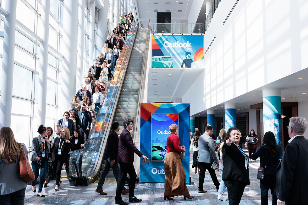
Once the visual language was established, it became a framework rather than a fixed set of assets. Environmental graphics, printed materials, stage visuals, and digital applications all pulled from the same DNA, but each adapted to its context.
Wayfinding wasn’t just functional, it became part of the atmosphere. Large-scale graphics helped define spaces and guide energy through the venue. Patterns and color fields created continuity without repetition.
The result was an experience that felt intentional at every touchpoint, even when attendees weren’t consciously thinking about design.


"This conference was a huge hit and a memorable experience for all that participated. Each year keeps wowing us. We can’t wait to see what next year brings."
Sarah Gilbert
Communications Manager, Visit California
What success looked like
The success of the forum wasn’t measured by aesthetics alone. It showed up in participation, engagement, and confidence.
Attendance reached over 970 participants, with an exceptionally high return rate from previous years. Post-event feedback reflected not just approval, but enthusiasm; people felt energized, connected, and aligned with Visit California’s vision moving forward. The forum also played a role in achieving a 98.3% approval rating in the associated referendum with record voter turnout, reinforcing trust and momentum for the organization.
Design didn’t just support the event, it helped carry its message.
72%
Returning
attendees
970
Attendees
98%
Membership
approval


Other work

REBRAND & WEBSITE

BRANDING & SALES ENABLEMENT

PUBLICATION
Why this project matters to me
Outlook Forum 2025 reinforced something I believe deeply about experiential design: when visuals are grounded in intent, they become invisible in the best way. People don’t remember individual graphics, they remember how the experience made them feel. This project wasn’t about creating a look. It was about creating belief, alignment, and energy through visual storytelling. That’s the kind of work I aim to do every time.
bottom of page